
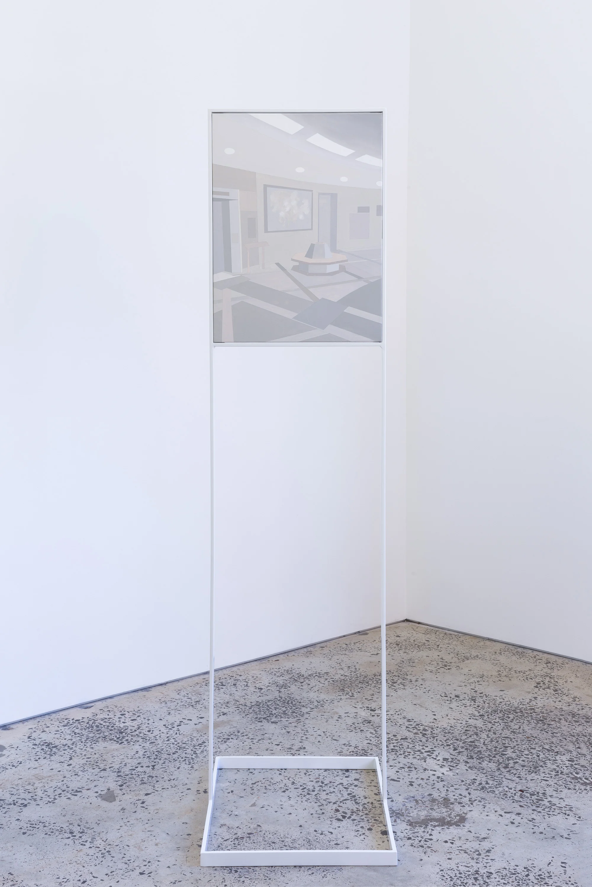
SITE/NON SITE, 2017, powder coated steel structure and gouache on stretched canvas, 184 x 63 x 48cm.
(Canvas size 61 x 46cm)
SITE/NON SITE, 2017, powder coated steel structure and gouache on stretched canvas, 184 x 63 x 48cm.

SITE/NON SITE, 2017, powder coated steel structure and gouache on stretched canvas, 184 x 63 x 48cm.

Flag (scientology), 2016, gouache on Ply board.
V.V.V.V.V.I.P.
Art fairs are a transient space for commercially motivated consumption. The material-semiotic messages transmitted by Marilyn Schneider’s sculptures and paintings communicate a complex interrelationship between architecture, the designed object, the art object, the environment and its inhabitants: actants that complete a circular capitalist narrative. This artwork, like the art fair environment, is a venue for experience: not just the framework through which art is experienced, but the framework is revealed as art, in and of itself.
Marilyn's work is, in this sense, paradisciplinary: situated vividly in relation to its forms of production, drawing attention to textural surfaces and architectural forms by reconstructing them with imitative materials that highlight their artifice. These reconstructions, isolated in the gallery space, demonstrate how our dominant cultural fantasies are deceptively integrated as part of a continuous lifescaping project, into seemingly benign architectures.
The socialisation of luxuries is a pencil drawing of Georg Jenson ‘Infinity’ cufflinks. Their enlarged size draws attention to their sculptural quality and highlights the culture and clientele that art fairs attract – being a luxury men’s accessory it points towards male power, dominance and wealth.
Marilyn uses architecture and material as a metaphor for our social conditioning, drawing links between production and consumption through a coded visual language. Beyond Product is a partition stud wall constructed from lightweight plywood and MDF, which indicates the temporal manufacturing of the art fair’s pop up and pack down culture. The wall’s façade presents a painting of Jonathan Anderson’s exhibit for the luxury fashion brand Loewe in Art Basel Miami 2015*.
Although Anderson did include established contemporary artists in his exhibit, the display acted as a backdrop for the staging of V.I.P. parties and events. By positioning themselves in an art fair setting, Loewe were able to encourage shoppers to associate the brand with art of high culture.
In an art fair context, high end luxury labels sit alongside mega galleries such as Gagosian and David Zwirner, indicating that big name artists have equal brand recognition and that their artworks are commodities which are collected to reflect economic status. A good example of this conspicuous consumption is when Kanye West gifted his wife Kim Kardashian a Hermès Birkin bag painted by George Condo for Christmas.
The wall behind the sculpture (Beyond Product) is clad with Microsoft Excel formulas that hint at the behind-the-scenes labour that underlies the staging of experiences and orchestrated events. Mega art fairs, blockbuster exhibitions and Biennales, along with their long list of public programs have become feats of administration rather than art. This subtle nod makes visible the inner-workings of the amorphous capitalist machine churning out art as a global luxury experience in the 21st century.
The art fair lounge presents the perfect metaphor for the economic shift towards a broadened cultural elite who value access, experience and consumption over ownership and acquisition. Where once social status was defined by one's property, (what one bought at the art fair) it can now defined by one's access to and participation in the fair's V.I.P. lounges and associated parties. Rented luxury, temporal luxury: these are the new points of access to the global capitalist dream, placing new emphasis on the materiality of experience.
The objects' materials, tones and textures communicate familiar yet abstract forms, allowing us to consider their social positioning and their communicative effects: the status attached to access – not just of luxury items but luxury environments – articulates a seamless integration of art with advertising, entertainment, fashion and design.
These objects at once reflect a vapid culture of generic luxury, whilst ironically creating that very aspirational allusion to the culture being critiqued. By documenting and presenting these simple elements as art, Marilyn abstracts the forms and aesthetics of art fairs and re-presents them as artworks, creating a witty irony: the artworks themselves are something to be desired, they create consumerist aspirations in the viewer even though at the same time she is deconstructing the same luxury economy that fuels the generic aesthetic that is antithetical to the production of art.
*Jonathan Anderson is the Creative Director for the Spanish fashion house Loewe.
Essay by Roslyn Helper.
Photography by Llewellyn Millhouse and Alrey Batol.

V.V.V.V.V.I.P. 2016, installation view.
Beyond Product, 2016, gouache painting on board, 50 x 60cm.

Beyond Product, 2016, laser cut vinyl letters, dimensions variable.

The socialisation of luxuries, 2016, framed pencil drawing on Arches paper, 29.7 x 42cm.

Beyond Product, 2016, laser cut Perspex logo (UBS Wealth Management), pine and MDF partition wall, 180 x 225 x 75cm.
GLOBAL TONE
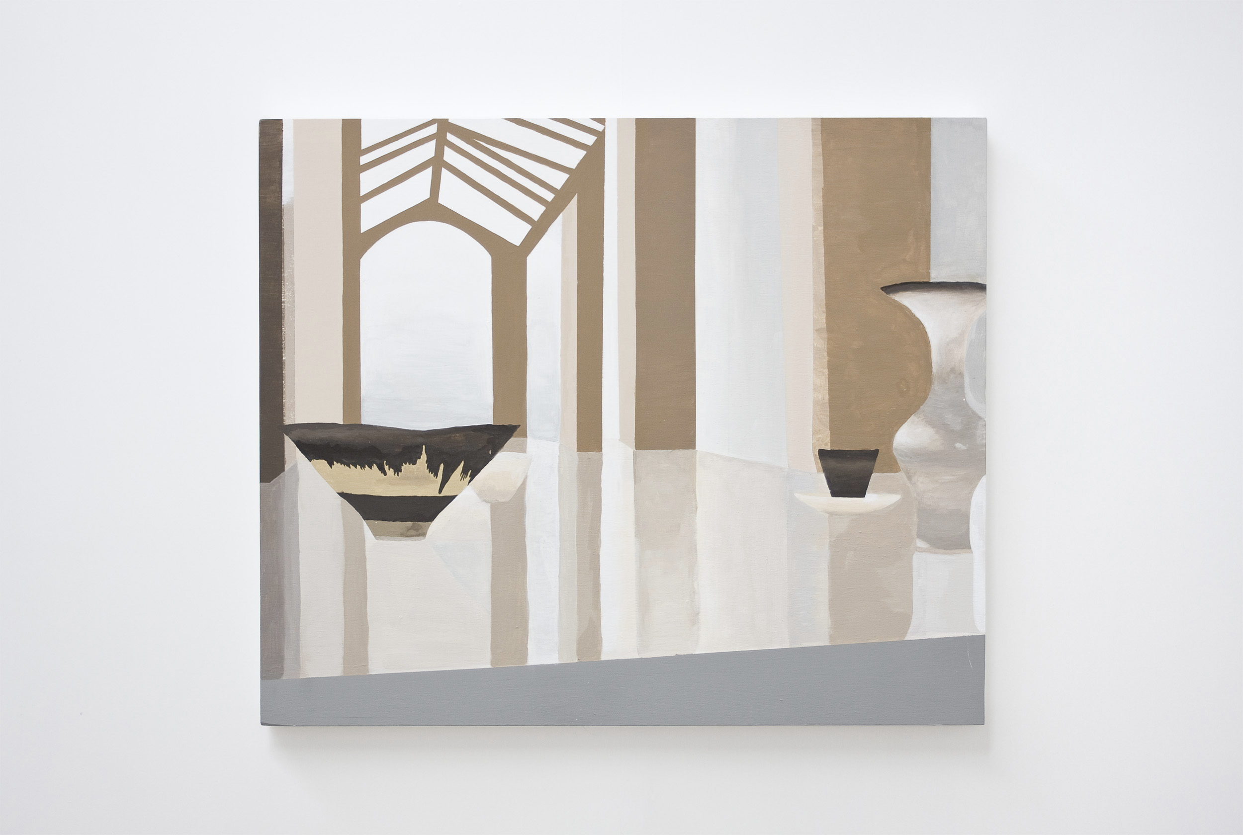
Fascinated by the sophisticated materials and organic forms that denote a futuristic image in Global Style architecture, Marilyn Schneider has created a sculptural installation that identifies and reconsiders this aesthetic. In a strict colour palette of grey and blue tones, selected icons have been manipulated into abstract compositions. These surfaces imitate the manufacturing methods of high capitalism such as laser cutting, mould making and powder coating. Isolated in the gallery space, these altered forms communicate how megastructures act as logos for the mega corporations that they house.
Photography by Document Photography (Pat Cremin and Sarah Kukathas) and Zan Wimberley.

Bubbles, 2015, framed caste resin, 51 x 71 x 3cm.

Bubbles, 2015, framed caste resin, 51 x 71 x 3cm.

Global Tone, 2015, installation view.

Smokey Mood, 2015, primer, spray paint on laser cut MDF, 120 x 200 x 1.8cm.
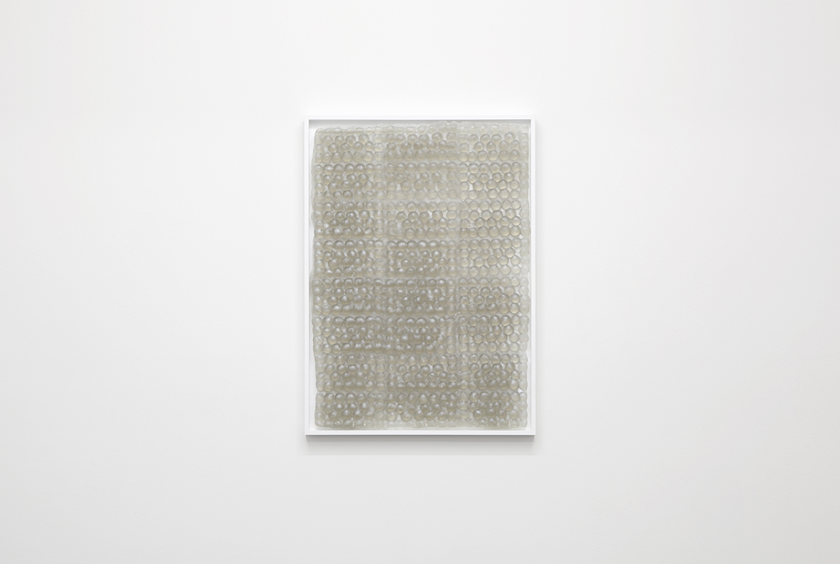
Bubbles, 2015, framed caste resin, 51 x 71 x 3cm.

Material Dreams, 2015, powder coated laser cut stainless steel, laser cut MDF, 120 x 21 x 20cm.

Global Tone, 2015, installation view.
FOREVER NEW
“Plastic is ubiquity made visible”
Roland Barthes - Mythologies
Forever New examines the synthetic materiality of architectural surfaces and finishes in urban spaces. The staged environments of shopping malls, hotel lobbys and airport lounges offer a vision of newness that is directly related to commerce.
The lustre of renovations, made from vibrant cheap materials, attempt to create an atmosphere of modernity and sophistication. With a strict colour pallete of brown and grey tones, these spaces are homogenous and formulaic yet with glossy new surfaces.
With their emphasis on the perpetual turnover of profit, they are continually remodelled, or even demolished and re-created, to accommodate the latest trend. In this context, demolition is not viewed as an act of destruction but, on the contrary, is celebrated as an urban spectacle in the anticipation of more (constructed) experiences to come. Thus the process of renovating has come to symbolise newness itself.
The works in this show draw attention to these textural surfaces by reconstructing them with imitative materials that highlight their artifice. These reconstructions, isolated in the gallery space, demonstrate the bland persuasiveness of commercially motivated architecture.
Photography by Lucy Parakhina.

Marilyn Schneider, Future/Classic, 2014, digitally printed polymeric vinyl with gloss lamination, PVC display board, 60 x 60cm.

Anna Kristensen, Brick wall, 2014, silkscreen ink and acrylic on canvas, 107 x 96.5cm.

Installation view, 2014.

Charlie Dennington, Pewter Cube, 2013, dimensions variable.

Charlie Dennington, Brick, 2013, polyurethane foam, dimensions variable.

Alex Kiers, K-FLEX, acrylic on canvas, push up bars, yoga matt, k-flex rubber tubing, ankle socks, dimensions variable.

Marilyn Schneider, Forever New, 2014, Laser cut vinyl lettering, partition wall - MDF, pine, screws.

Installation view, 2014.
Marilyn Schneider, Forever New, digital collage, 2014.
PARALLAX PLAZA
It is obvious that the new Citroën has fallen from the sky inasmuch as it appears at first sight as a superlativeobject. We must not forget that an object is the best messenger of a world above that of nature: one can easily see in an object at once a perfection and an absence of origin, a closure and a brilliance, a transformation of life into matter (matter is much more magical than life), and in a word a silence which belongs to the realm of fairy-tales.
Roland Barthes’ very short essay in Mythologies (1957) on France’s most iconic car – the Citroën Pallas DS (nicknamed the ‘Goddess’) – reads more like an adoring catalogue essay by Citroën, for Citroën, than an essay by one of France’s most iconic critics. Ever beautifully written, but done so with a melted heart, soft at the knees Barthes attests that “the Deesse is first and foremost a newNautilus.” His adoration for this object, an object of movement and transportation, exposes the kind of desire a manufactured thing of beauty can offer. A visual language of luxury, of effortlessness and an ease of life, was the key to the D.S.’s allure – its beautiful curves floated on air suspension and carried all the right people.
Marilyn Schneider’s Parallax Plaza is an installation of several discrete elements that draw upon, and use materials and motifs from a coded visual language of luxury – with an especial fondness for the nautical variety. It is the language that resides in the design and promotion of ‘the most elegant’ yachts and cars, houses and malls, clothes and lifestyle. It is most overt in master plans for future ‘global precincts’ – think Barangaroo and its imagery and purpose. Its most subtle form is simply the act of having – the half-million dollar cars that flood our streets, Superyachts bobbing in the harbour. This visual language is embedded within the materials and finishes used to outwardly suggest success.
At its best, this visual language is singular in its ability to remove reality and humanness from our understanding of living. It acts as an anti-memento mori, encouraging us to imagine ourselves in a cocoon of immortality, furnished with the most elegant finishes. It urges us to imagine and to relish the ease with which we could glide down never-ending corridors of luxury. One of the most dominant aspects of luxury architecture, culture, and its promotion, is the emphasis on the seamless transition from one luxurious space to another. Luxury yachts, high-end malls, and modern mansions share similar fit-outs and finishes. The idea is: your exact position is indeterminate, and somewhat irrelevant – taste, refinement and elegance are global. Luxury becomes an environment.
Schneider’s installation takes these materials and turns them into a dizzying melange, breaking up their normally cosseting function. Dislocated from their intended purpose, and remodelled as art-objects, they present a distorted view of aspirational luxury. Through re-purposing the materials and imagery of luxury, an accepted order is disturbed, but this work does not simply rail against a life of luxury. Schneider’s uncanny re-imagining of the imagery of luxury, complete with giant a seahorse, (the mascot of a French yacht company) Broadening the horizons of your dreams (a discreet sense of luxury), is tinged by disillusionment. This lifestyle is mere projection and imagery. Implicitly Schneider acknowledges the beauty and the allure of the materials and language at use. There is an obsessive fascination with their capability to deceive and enamour. Broken apart and reconstituted under bright light, they are laid bare to be examined and, to be admired.
Essay by Kevin Platt.
Photography by DocQment.

Future/Classic (comfortably classy and reassuringly reserved), 2014, laser cut decal, 32 x 109cm.

Parallax Plaza, 2014, installation view.

Abstraction as camouflage, 2014, digital collage printed on adhesive vinyl, 60 x 60cm.

Floor work: Broadening the horizons of your dreams (a discreet sense of luxury), 2014, laser cut vinyl applied to Perspex, custom made synthetic teak mat, Eco wood decking, 90 x 35 x 14cm.
Wall work: Water’s edge, 2014, boat decals painted on wall, 3 x 2 metres.

Parallax Plaza, 2014, installation view.
NEW WORLD
Never/again
With the same maniacal logic that characterised his earlier visions, Roxy then considers adding hallucinogenic gases to the atmosphere of his theater, so that synthetic ecstasy can reinforce the fabricated sunset. A small dose of laughing gas would put the 6,200 visitors in a euphoric mood, hyper-receptive to the activity on the stage. His lawyers dissuade him, but for a short period Roxy actually injects ozone – the therapeutic O3 molecule with its “pungent refreshing odor” and “exhilarating influence” – into the air-conditioning system of his theater.
In his ‘retroactive manifesto for Manhattan’, Delirious New York (1994), Rem Koolhaas tells us that not long after the Wall Street Crash of 1929, John D. Rockefeller Jr. bought the theatrical impresario Samuel Lionel ‘Roxy’ Rothafel away from Paramount Pictures to have him design the Radio City Music Hall at the ‘masterstroke of architectural cannibalism’ that was the Rockefeller Centre. Roxy made the venue’s interior into a recurrent sunset, claiming the idea came to him in a dream.
New World is a sculptural installation by Marilyn Schneider, exhibiting an abstracted simulation of the abstract, simulated environments of trade exhibitions. During a recent residency in Beijing she spent time documenting the ubiquitous but elusive structures of trade show booths there. Functioning simultaneously a signs, objects and spaces, these prefabricated pop-up displays can vanish as quickly as they appear. At the entrance to New World there’s a shiny sculpture-sign with the unspecifically promising words New World spelt out in a sleazy corporate font. Having previously worked with reality TV sets, display homes and Westfield shopping malls, Schneider often hones in on the uber-contrived, self-contained world-spaces that surround us with unfulfillable potential. Both ephemeral and pervasive, these vaguely defined, highly glossed, placeless enclosures proliferate across our ‘fantastic landscape in anti-authenticity’ – to borrow words from Koolhaas’s description of Roxy’s atmospherically manipulative Depression-era theatre. Take a deep breath.
- Amelia Groom
Photography by Jack Dunbar.

New World, 2013, polished stainless steel, 102 x 17cm.

New World, 2013, polished stainless steel, 270 x 17cm.

New World (installation view), 2013.

Support structure, 2013, Primed Pine, screws and acrylic paint, 267 x 546cm.

Display booth, 2013, acrylic paint, 317 x 403 x 267cm.
LEISURE KITSCH
Photography by Sam Scoufos.

Marilyn Schneider and Bonita Bub, Leisure Kitsch, 2014, steel poles, marine rope, outdoor fabric, hooks and D rings, 10 x 4 x 3 metres.

Marilyn Schneider and Bonita Bub, Leisure Kitsch, 2014, steel poles, marine rope, outdoor fabric, hooks and D rings, 10 x 4 x 3 metres.
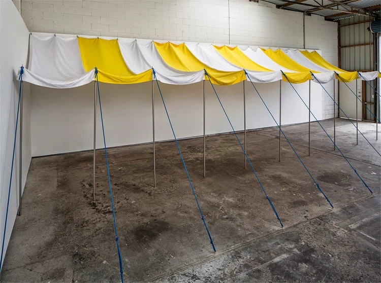
Marilyn Schneider and Bonita Bub, Leisure Kitsch, 2014, steel poles, marine rope, outdoor fabric, hooks and D rings, 10 x 4 x 3 metres.

Marilyn Schneider and Bonita Bub, Leisure Kitsch, 2014, steel poles, marine rope, outdoor fabric, hooks and D rings, 10 x 4 x 3 metres.
THE APPEAL OF THE REAL
Marilyn Schneider is interested in commercial experiences and how we interact with the architecture of these highly designed, emotionally controlled constructions. Her interest lies in analysing the framework of spaces such theme parks, casinos, shopping malls and display homes. For her most recent body of work The appeal of the real, Schneider presents three works that engage with the constructs of Hollywood luxury mansions as seen in many reality television shows. The appeal of these spaces lies in their tightly composed façades. Every furnishing is a prop, every colour an emotional branding used to engage the viewer in the ‘realness’ of what they are seeing.
Schneider’s interest in the Hollywood home as a set is seen in Screen Wall, a 4 x 4 metre decorative brick wall made using store bought foam sheeting. In contrast to the television viewer who is restricted in their viewpoint, the gallery audience has the privilege of seeing these objects up close and from behind where we are privy to imperfections and support structures – in this case, the wooden beams needed to hold the work up.
In Mega Mansion, the artist uses model-making materials to create a reduced scale hybridisation of mansions typical of the Hollywood genre. Schneider’s merging of various architectural forms only emphasises the banality of these spaces. The structure’s excess is particularly grotesque when realising that the houses used in many of these television shows are set homes and likely purchased solely for filming purposes.
The use of Chroma key green paint in Feature Wall/Green Screen, references the construct of these set homes and the performances that take place within. In a gallery setting however, this colour questions the role of the viewer. Surrounded by green, we are no longer just looking but have become the stars in our very own television show.
-Tom Polo.
Photography by Silversalt.

The appeal of the real, installation view, 2012.

Screen Wall, 2012, Hand cut EVA foam, PLY wood, screws, acrylic paint, 362 x 334cm.

Feature Wall/ Green Screen, 2012, Chroma key paint.

The appeal of the real, installation view, 2012.

The appeal of the real, installation view, 2012.

Mega Mansion, 2012, foam core, DVD cases, Chroma key paint, cardboard, 150 x 60 x75 cm.

Mega Mansion, 2012, foam core, DVD cases, Chroma key paint, cardboard, 150 x 60 x75 cm.
DIRECTORY
“In Disneyland, the customer finds themselves participating in the fantasy because of their own authenticity as a consumer."
- Umberto Eco
With reference to Caesars Palace in Las Vegas, and European formal garden designs of the Renaissance, Marilyn Schneider uses sculptural installation to recreate the existing floor plans of the recently built Centrepoint Westfield in Sydney. These maps, as simplified two dimensional renderings of immersive physical environments act as ‘original’ templates, which Schneider distorts to evoke an epitomical architecture of conspicuous consumption.
The space that Schneider depicts is a hypothetical amalgamation, that imitates the navigational function of signage and brochures. When viewers look at these ‘real’ maps of immersive space, they have to imagine themselves in the larger physical context of the complex, thus Directories introduce viewers to the idea of positioning themselves within the complex as a self contained world.
Using imagery and iconography from “Ancient Rome” the exorbitant theming in Caesars Palace creates an imitation fantasy world that signifies decadence and excess. The interior of the new Westfield is not only similar in architectural façade, with an excessive placement of columns and marble; it is also cladded with surfaces that imitate the seemingly glamorous aesthetic of the high-end Italian fashion brands that the center facilitates. With winding paths, and few exits, this maze-like navigation thus encloses the viewer in an immersive ‘world’ that is aligned with contemporary symbols of luxury, in order to convey the notion of status. This profit orientated theming attempts to create a physiologically reassuring consumer experience, which is perfect in a commercial space that relies upon fantasy, gambling and chance.
The aesthetic of the works in Directory are aligned with the commercial theming of Westfield to create an image that is non-representational, unlike the easily recognisable props and backdrops inherent in themed entertainment spaces. These re-mapped ‘Directories’ aim to highlight how fantasy is so deceptively integrated into the architecture of commercial space.
Photography by Charles Dennington.

Westfield, 2011, EVA foam, felt and PLY wood, 120 x 120cm.

Level 1 Westfield, 2011, felt scratch guard and foil board, 180 x 90cm.

Directory, 2011, installation view.

Westfield, 2011, imitation marble floor tiles, foil board and MDF, 240 x 122cm.

Archway (detail), 2011, foam core and decorative contact adhesive, dimensions variable.